Popaste
Flavored ToothPaste Branding Project
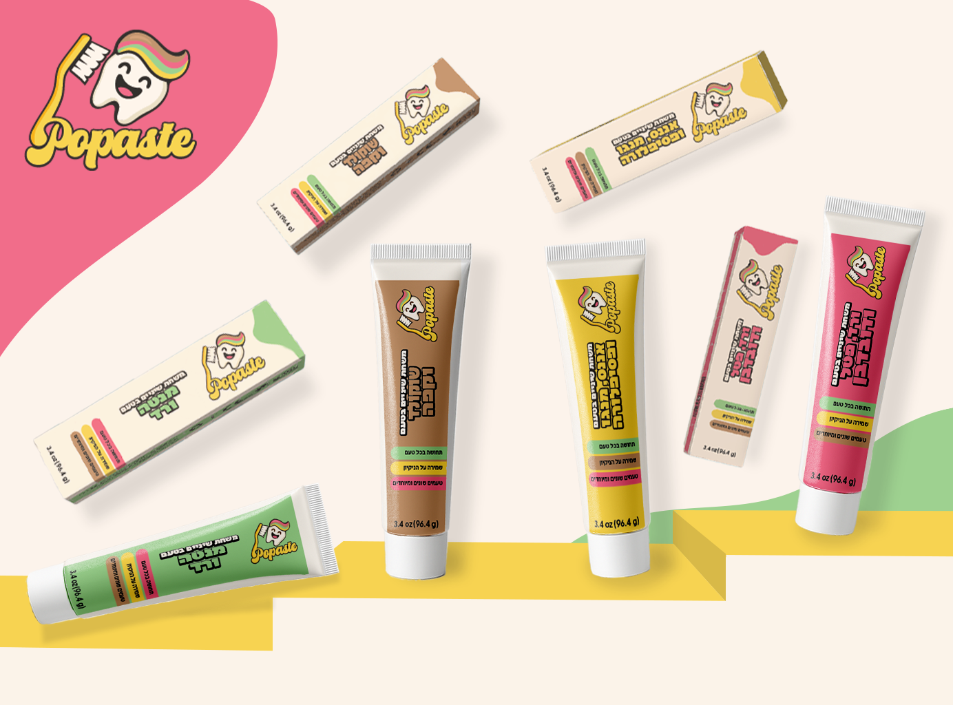
Popaste Is A Conceptual Branding Project For A Flavored ToothPaste Line Designed To Transform The Everyday Act Of Brushing Teeth Into A Fun, Engaging Experience.
The Project Explores How Flavor, Color, And Character Design Can Influence Mood, Emotion, And User Perception.
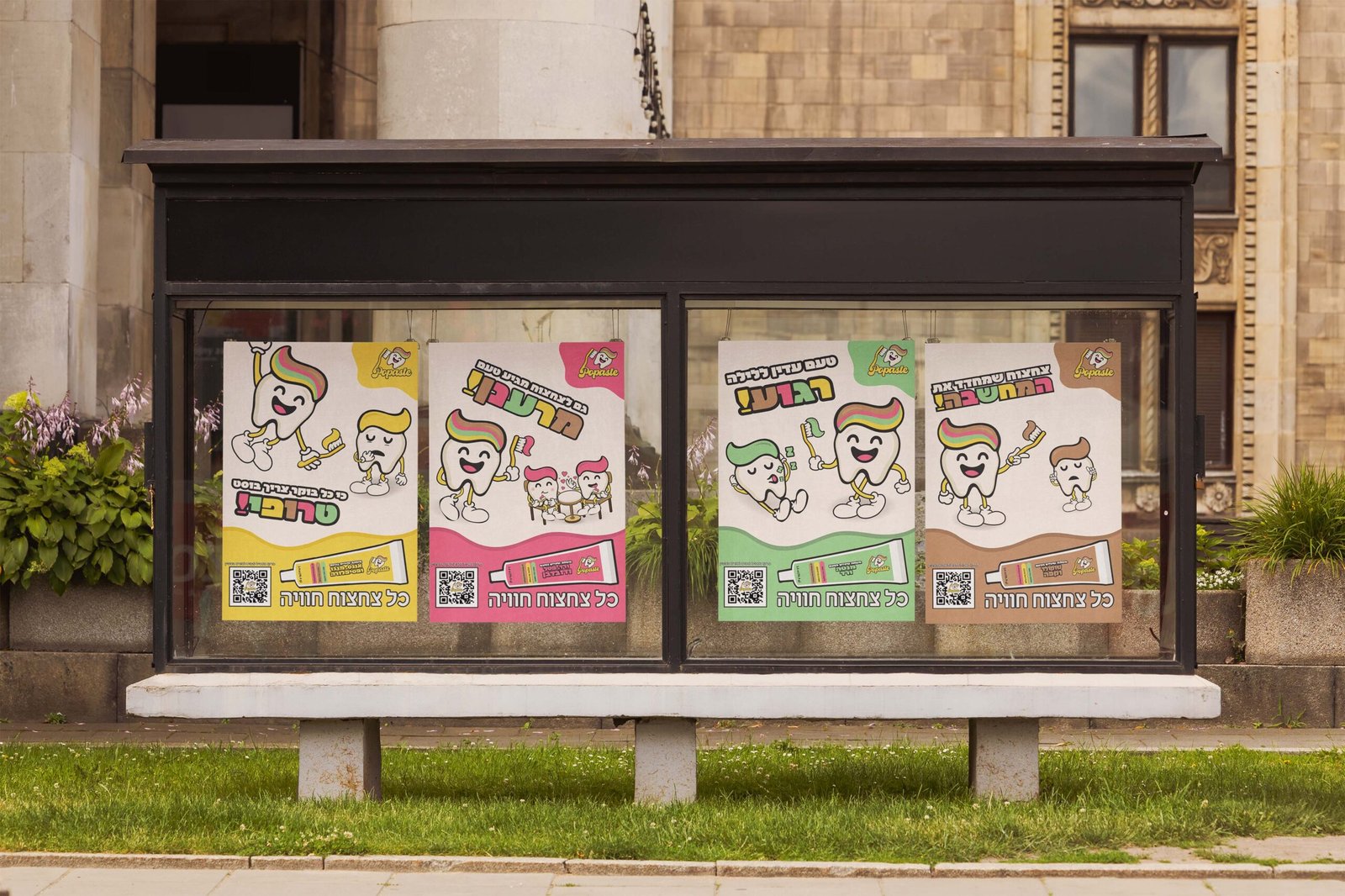
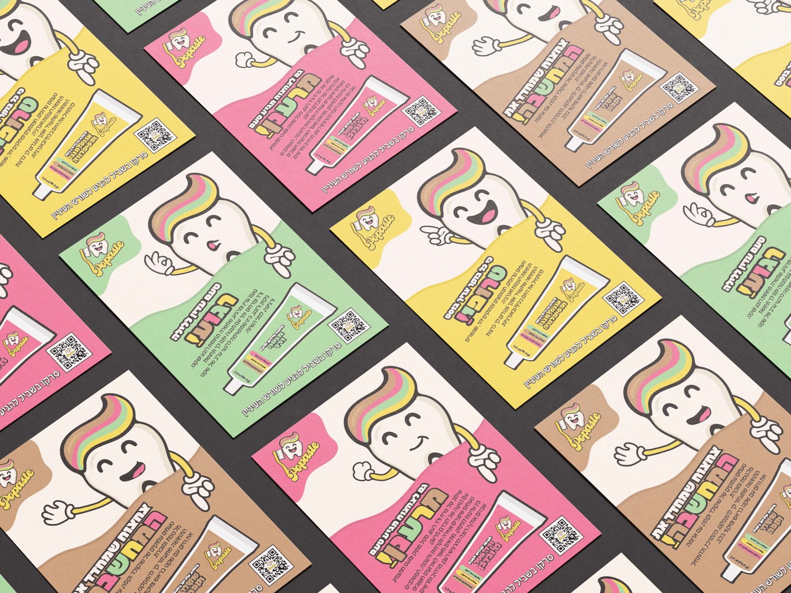
The Brand Includes Multiple ToothPaste Flavors, Each Representing A Different Sensation And Target Audience, Such As Focus, Freshness, Vitality, And Uniqueness.
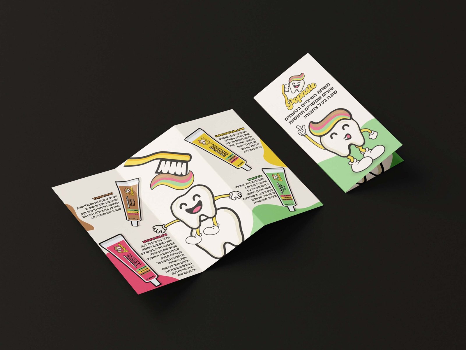
Each Flavor Was Translated Into A Distinct Visual Identity Through Color Palettes, Typography, And Playful Illustrations, While Maintaining A Consistent And Recognizable Brand Language.
The Design Combines A Cartoonish And Friendly Aesthetic With A Clean, Modern Layout, Aiming To Appeal To Both Young Adults And Parents With Children.
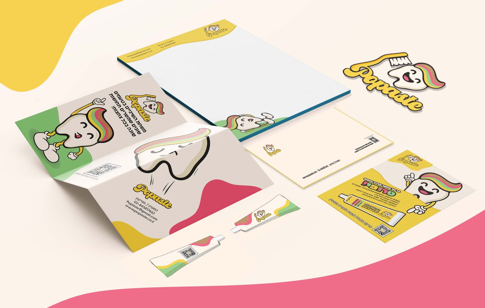
The Project Includes Logo Design, Packaging, Posters, Digital Assets, And A Recurring Cartoon Tooth Character That Appears Across All Brand Touchpoints.
Popaste Demonstrates A Full Branding Process, From Concept And Strategy To Visual Execution, Focusing On Storytelling, Differentiation, And Emotional Connection Through Design.
The Main Challenge Was To Create A Cohesive Brand Identity That Could Support Multiple ToothPaste Flavors, Each With Its Own Personality, Without Losing Clarity Or Visual Harmony.
The Brand Needed To Feel Fun, Approachable, And Memorable, While Still Communicating Reliability And Everyday Usability Within The Oral Care Category.
The Process Began With Research Into Existing ToothPaste Brands, Focusing On Visual Language, Color Usage, And Market Differentiation.
From There, Concept Development Explored How Flavors Could Be Translated Into Color Palettes, Typography, And Graphic Elements.
Each Flavor Was Designed As A Unique Variation Within A Unified Design System, Ensuring Consistency Across Packaging While Allowing Individual Expression.